I’m currently at ISEA2012, the 18th International Symposium on Electronic Art, a six-day international conference, this year taking place in Albuquerque under the glorious banner ‘Machine Wilderness’, which references the New Mexico region as an area of rapid growth and technology within vast expanses of open land.
Astrophysicist and President of the Leonardo Institute for Art, Science and Technology, Roger Malina gave a keynote to a packed auditorium, in which he discussed (in a rich and wide-ranging lecture) the epistemological revolution that is underway with the arrival of the era of “big data”. The amount of data in our world has exploded, Malina explained. Today, each day we create 2.5 quintillion bytes of data (source: IBM). This trend is accelerating so fast that 90% of the data in the world today has been created in the last two years alone. Data sets have become so large and complex that it has become extremely difficult to process using current tools. Malina argued that there is a critical role for artists in creating new systems of data representation, visualisation, sonification, and simulation, across fields ranging from astronomy, geology, nanoscience and medicine, to business and finance. It’s not a field in which I am an expert, but it strikes me that – as well as the systems that Malina outlines – the key contribution that artists can make is in helping to create meaning and poetry from these vast data fields.
At ISEA, there are a few examples of artworks using large data arrays. Agnes Chavez & Alessandro Saccoia’s (x)trees, for example, at the Albuquerque Museum of Art & History is a socially interactive virtual forest generated from search words found in tweets and text messages, an experiment in data visualisation, video mapping and participatory art.

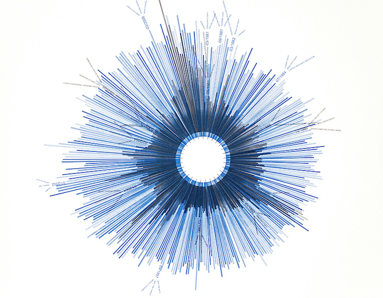
To give some other examples of data-driven art, below is a work by Jer Thorp, data artist-in-residence at the New York Times. It shows how often the times printed the words “hope” and “crisis” between 1981 and 2010. Each bar represents a month, Dates and mentions of specific events and key words are thrown in here and there to orient the viewer. It’s interesting to note those times when crises eclipsed hope.
A famous work is Mark Hansen and Ben Rubin’s Listening Post, which culls fragments of text in real-time from thousands of Internet chat rooms and other virtual public spaces, identifying prevailing themes and topics of discussion. The texts are then read (or sung) by a voice synthesiser and simultaneously displayed across a suspended grid of more than two hundred small electronic screens. The communications include statements about nationality, age, gender, sexual preference, religion, politics or everyday life. At striking moments, the text washes rapidly across the screens in patterns before clicking to a halt. The work evokes the drama of our technological lives.

Two examples of artworks that use data sets relating to climate were shown by Arts Catalyst in the exhibition ‘Data Landscapes’ last year. The exhibition arose from a network of the same name, coordinated by CREAM (The Centre for Research and Education in Arts and Media, University of Westminster), which set up discussions around the use of the data and models of climate science within visual arts contexts. The data of climate science has come under intense public scrutiny over the last couple of years, and the network understood that art practices that concern themselves with environmental change need some understanding of how the knowledge of climate change is produced. After a series of fascinating workshops, a seminar and exhibition were held at Arts Catalyst.
The Southern Ocean Studies by Tom Corby, Gavin Baily + Jonathan Mackenzie (also later shown in ISEA2011 in Istanbul) was a projection showing the currents circulating the central Antarctic land mass. These were generated in real-time and mapped against other environmental data sets – tidal flow, wind direction, geochemical and atmospheric flux – to produce flickering constellations of carbon circulation and wind direction. Watching the artwork, it is tempting to see the swirling forms as representative of an Antarctic wilderness, however the patterning effect is as much a product of human activities as natural ecologies. Whilst respecting the underlying science, the work sought to develop a sensibility to the dynamics of ecological complexity as pattern and felt experience rather than quantity and measure.

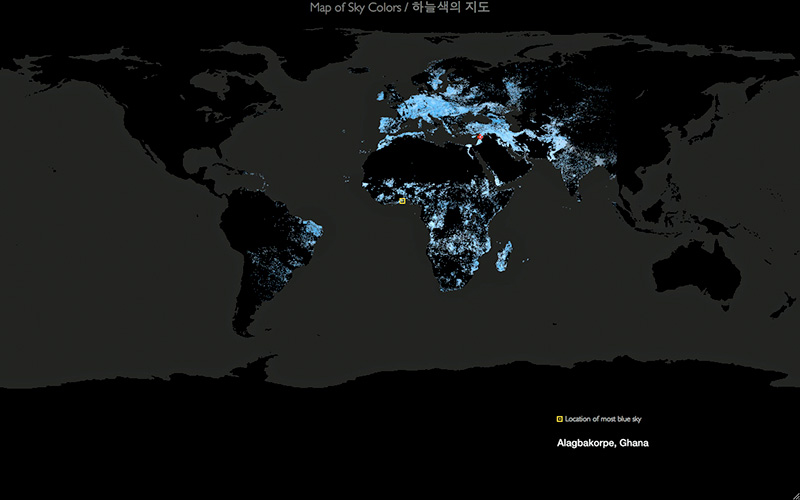
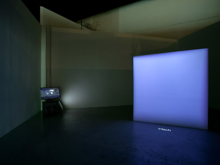
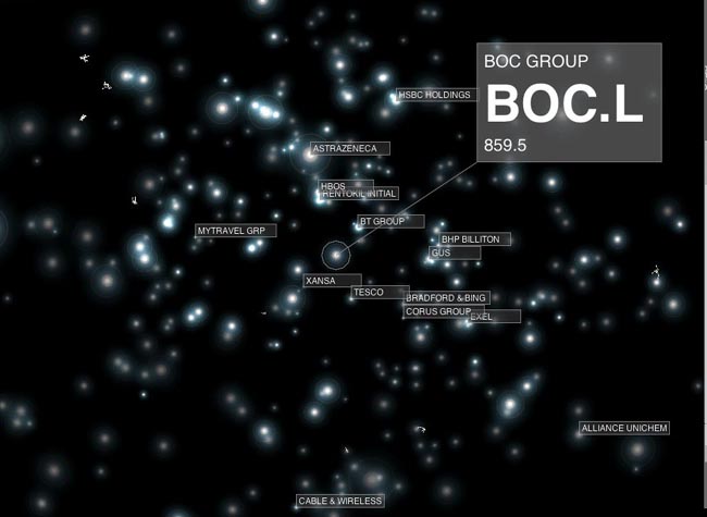
In the same exhibition, Lisa Autogena + Joshua Portway’s installation Most Blue Skies calculated the passage of light through particulate matter in the atmosphere and computed sky colours for five million places on earth. A specially developed lighting system then reproduced, minute by minute, the colour of the bluest sky in real-time and displayed its location. Most Blue Skies addressed our changing relationship to the sky as the subject for scientific and symbolic representation. The artwork used advanced real-time satellite and atmospheric sensor data, which was processed by custom-built software, simulating the passage of light through the atmosphere. It played with the tension between the simplicity and romance of the image of the blue sky, and the complex technology involved in measuring and representing it. A previous work of Autogena + Portway was Black Shoals Stock Market Planetarium in which multinational stocks appeared as glinting stars in a night-time constellation, shifting and flickering depending on how the shares of each company were trading in real-time.
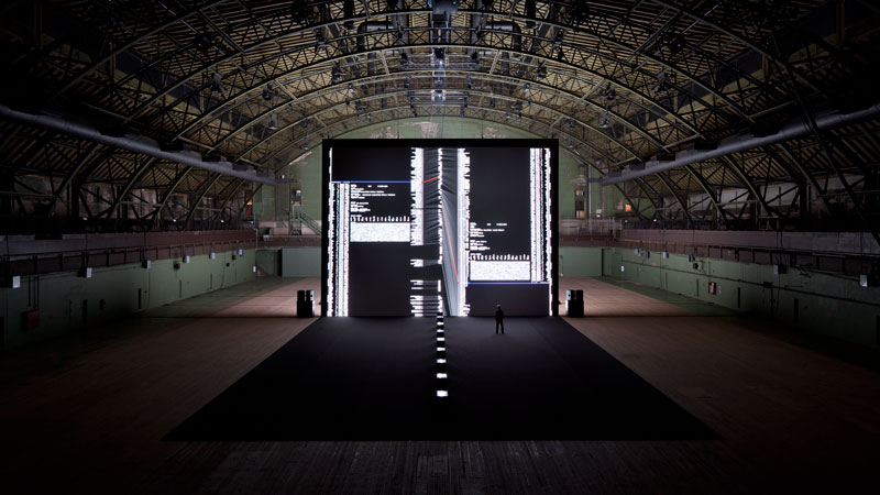
Sonification is another technique used by artists to re-present data. Sound artist Ryoji Ikeda’s project datamatics was a series of experiments that used pure data as a source both for sound and dynamic imagery. From 2D sequences of patterns derived from hard drive errors and studies of software code, the imagery transformed into rotating views in 3D, whilst the final scenes add a further dimension as four-dimensional mathematical processing opened up new vistas. The soundtrack used layering of sonic components to produce acoustic spaces.
The challenges of big data are huge. But to develop new systems and tools to deal with big data, developers need to be able to play with data. That means data needs to be protected only lightly by copyright and it needs to be delivered in formats that are useful to people. The idea that data should be freely available to everyone to use and republish as they wish, without restrictions from copyright, patents or other controls, is called “open data” and it is rapidly gaining support, particularly in areas such as science and government. Dealing effectively with big data demands an open data approach, whilst the movement towards open data requires new tools to make sense of large data arrays.
Other examples of good ‘big data’ art? Do let me know.
How to get started with data-driven art? A few tools and tutorials (and please suggest additions):
http://flowingdata.com/category/tutorials/
http://freeartbureau.org/blog/2011/11/09/tutorial-data-visualisation/
can we already talk about data-driven art movement?
I think we can
Hello! Thank you for your post! What do you think about the Dumpster of Golan Levin, or his Numbers, or the works of Jonathan Harris between 2003 and 2008 (We Feel Fine, I want you to want me, Lovelines)? It is interesting that the Dumpster and We Feel Fine, very similar projects (visualizations of blog fragments containing keywords referring to personal feelings which the user is encouraged to read) appeared almost at the same time (February and May 2006 respectively) and were not followed by similar projects.Maybe because Twitter launched in 2006 and one could search there easily, maybe Blogscope became more popular – I don’t know why)
Liana